Map design
Map design is fascinating. It is one of the highest forms of information design. How to convey complex information so that it is instantly accessible. The map showing Napolean’s foray into Russia in Edward Tufte’s books where he plots the size of the the army vs their penetration into the country is a classic example.
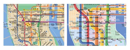
Subway and bus maps are especially interesting because they have to serve multiple purposes: they have to be legible from a distance (across a crowded subway car), they have to convey data quickly (should I get off here or is the next stop closer to where I want to go) and they have to be useful to locals, who know their geography and tourists who may not know where they are immediately.
Eddie Jabbour of Kick Design has redesigned the NYC subway map. His new map is clearer and easier to parse visually, but he has abandoned spatial continuity. The comparisons on his site between the old and new are obvious and even if you don’t like his proposed map, the design is instructive.
No comments yet. Be the first.
Leave a reply