Archive for the 'Design' Category
MAX 2009 talk – New Experimental Work from Joshua Davis
I missed this talk from Joshua Davis at MAX last year and I regret it. Very inspiring and I really like the way he walks you through his process and embraces failure and experimentation.
MAX 2009 Design – New Experimental Work from Joshua Davis | Adobe TV
No commentsNice typography-based motion graphics design work
Flickermood 2.0 from Sebastian Lange on Vimeo.
Fudgegraphics – Graphic Design Inspiration

fudgegraphics.com combines tutorials, portfolios and free downloads together. A great source for graphic designers or other visualists. As a side note, it is also a great promotional site for its creator Franz Jeitz as it is also a showcase for his skills and knowledge. For designers looking to promote their work beyond the standard portfolio site, there are some great ideas here.
Nice visualization from the NYT
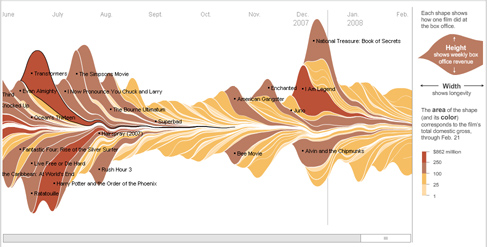
Conveying data that spans more than 2 dimensions is classically difficult. In fact, successful representations like the map of Napoleon’s march from CJ Minard are celebrated. I saw this Flash thing from the New York Times representing box office returns from Hollywood films and I was really impressed how nice a job it did showing some disparate things in a cohesive way. Worth taking a look at if you think about this kind of stuff.
No commentsI’m guessing that they were inspired by Kuler, but they could have been first. I’m not sure. ColourLovers.com is extremely similar, create and share (and download!) color palettes. The ColourLovers folks did a couple smart things though, allowing you different types of downloads and also methods to embed palettes into your web pages.
![]()
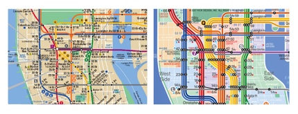
Map design
Map design is fascinating. It is one of the highest forms of information design. How to convey complex information so that it is instantly accessible. The map showing Napolean’s foray into Russia in Edward Tufte’s books where he plots the size of the the army vs their penetration into the country is a classic example.
Subway and bus maps are especially interesting because they have to serve multiple purposes: they have to be legible from a distance (across a crowded subway car), they have to convey data quickly (should I get off here or is the next stop closer to where I want to go) and they have to be useful to locals, who know their geography and tourists who may not know where they are immediately.
Eddie Jabbour of Kick Design has redesigned the NYC subway map. His new map is clearer and easier to parse visually, but he has abandoned spatial continuity. The comparisons on his site between the old and new are obvious and even if you don’t like his proposed map, the design is instructive.
Nice site for new propaganda design
This is an associated website for the new Nine Inch Nails album. They are soliciting propaganda in multiple media and then distributing it. So far it looks like the submitted work is mostly posters. The work on the site is fairly high quality. Could become a nice resource for design ideas when you are stuck.
No commentsMK12
I just watched the DVD for “Stranger Than Fiction.” Good movie, but I really like the title sequence and the nice use of motion graphics as part of the story telling, integrated into the video. Bummer is that they don’t have any of it in the most recent reel on their site, but you can check out their other work which is also quite nice.
[Added 3/14/07]
from avclub, I found a link to one of the sequences MK12 did in the film.
No comments