Nice visualization from the NYT
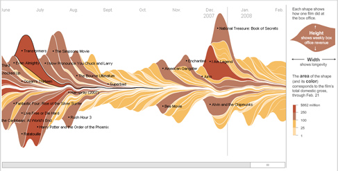
Conveying data that spans more than 2 dimensions is classically difficult. In fact, successful representations like the map of Napoleon’s march from CJ Minard are celebrated. I saw this Flash thing from the New York Times representing box office returns from Hollywood films and I was really impressed how nice a job it did showing some disparate things in a cohesive way. Worth taking a look at if you think about this kind of stuff.
No commentsNo comments yet. Be the first.
Leave a reply